Visual design —
Digital, physical
Design lead
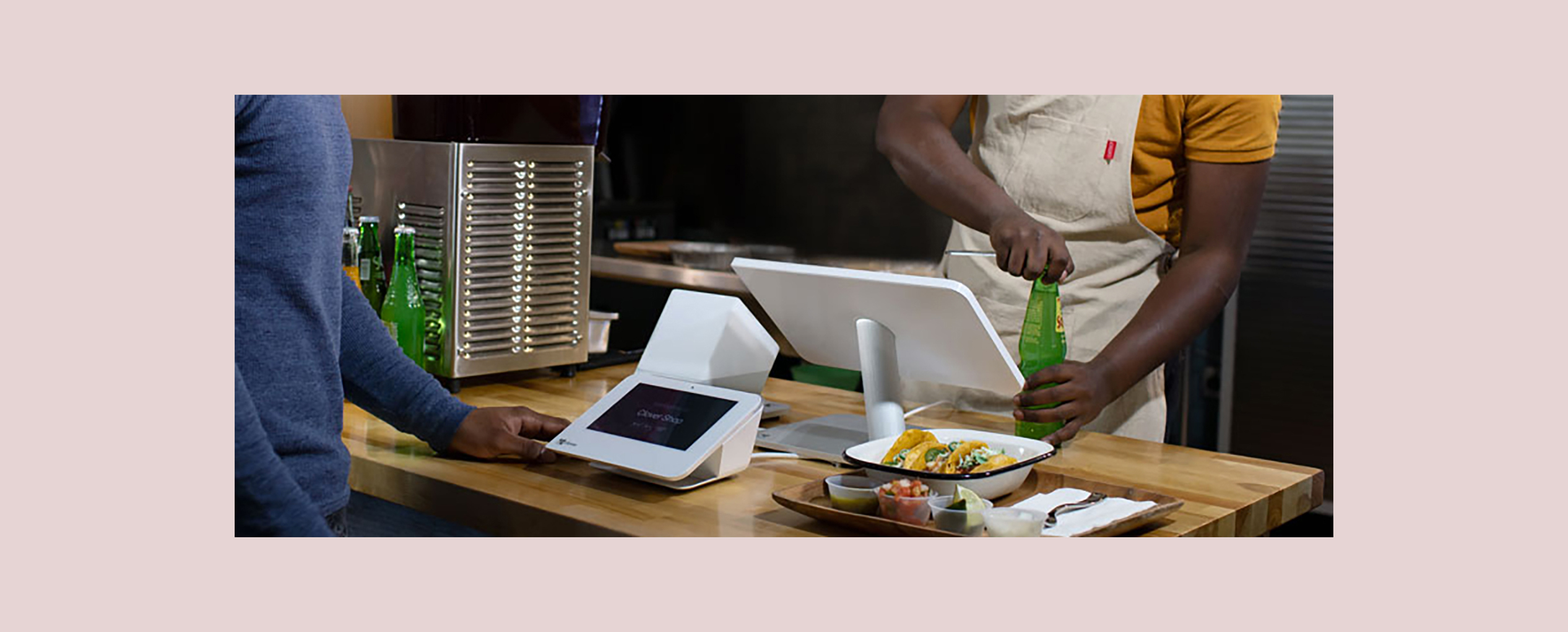
Clover is a point-of-sale company, providing apps for each business type owner to customize their own experience. As their first designer, I contributed on 9 Clover products. Product scope: Android and web apps, packaging, print, hardware, and internationalization.
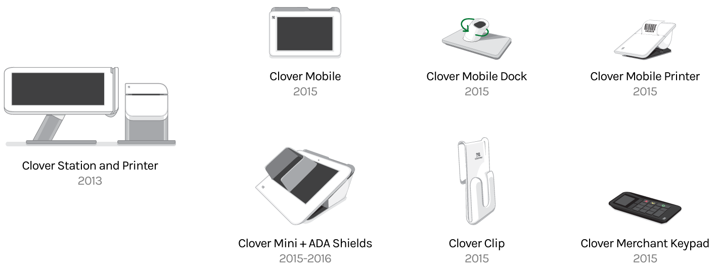
In 2013, Clover launched the Clover Station. A more mature brand experience needed to be established, allowing for company growth and further product expansion. As the first visual designer, I developed a new consistent brand across the digital and tangible aspects of the company.
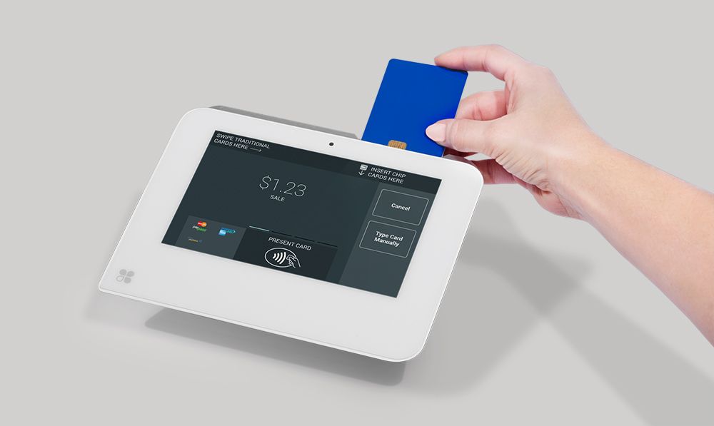
I started with a new color palette that had a wider range, keeping in mind minimum print and screen contrasts. With the larger Clover Station screen and white hardware, I kept the lighter background for a cleaner overall look.
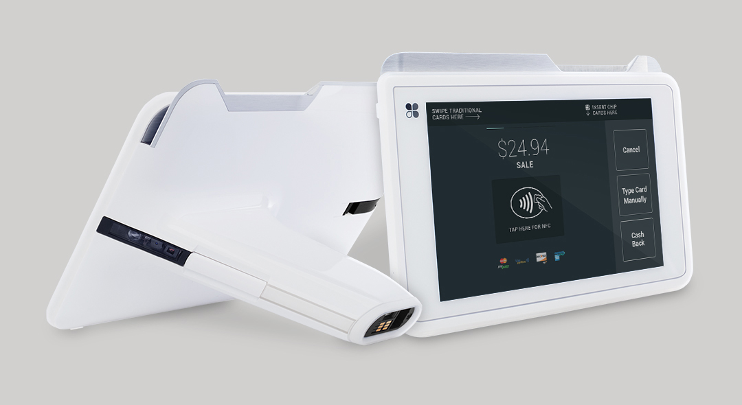
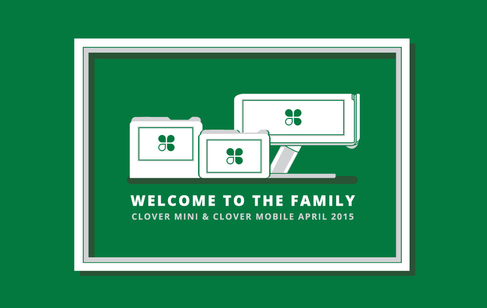
In 2015, Clover launched Clover Mobile and Clover Mini, both compatible with Clover Station. With many new core apps in the pipeline, we explored the option of a dark colored theme as a way to differentiate between the devices. After seeing how the app icons visually failed sitting on both light and dark backgrounds, a majority of them were updated.
Old Tips app icon on both light and dark
New and updated icons using same palette
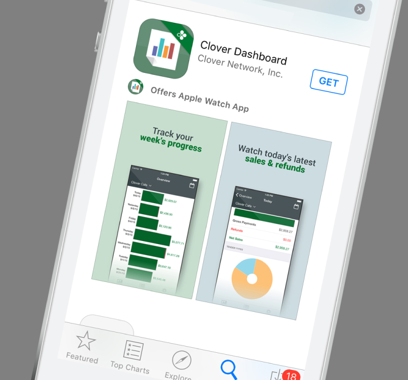
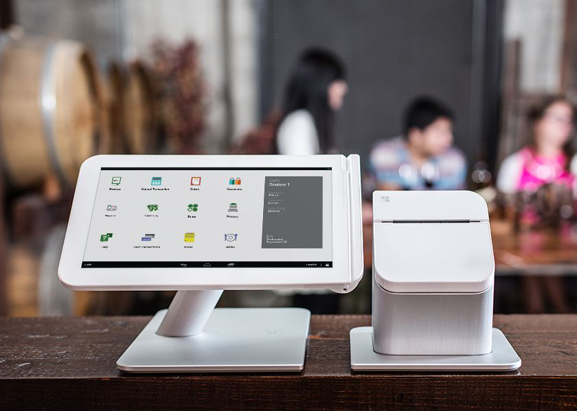
The visual style of the icons extended seamlessly into the instructional product illustrations. Product photography colors complimented or emphasized screen colors and activity. Also developed a partner iOS app for merchants to increase Clover usability.
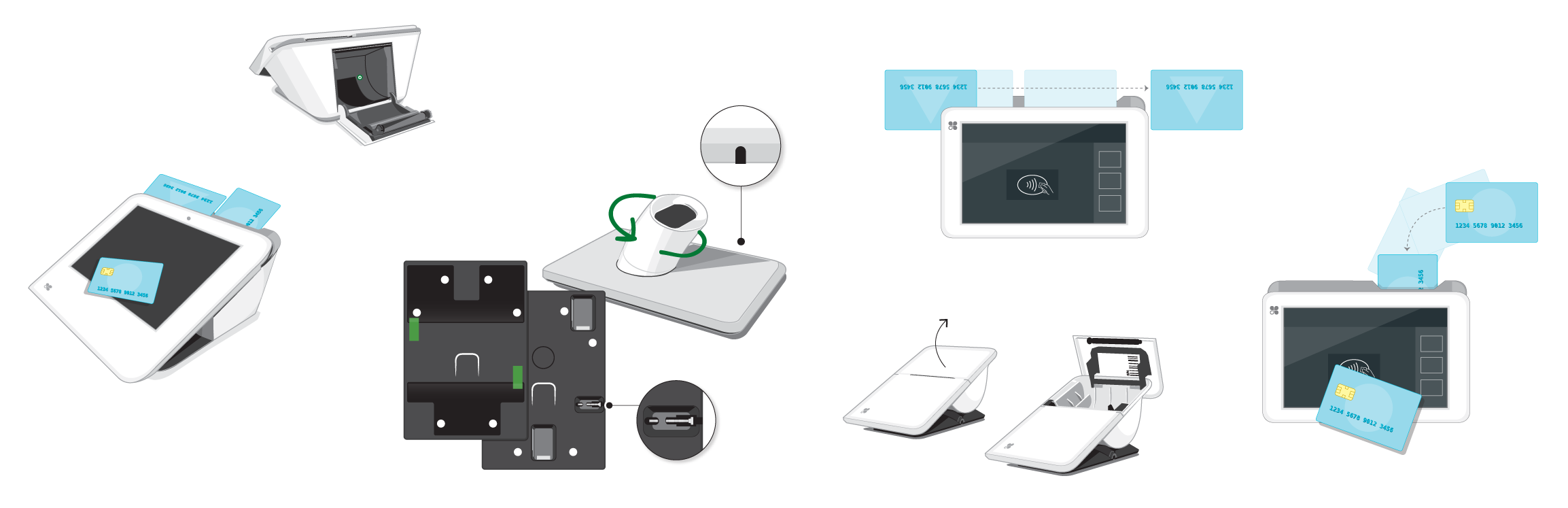
User guide illustrations
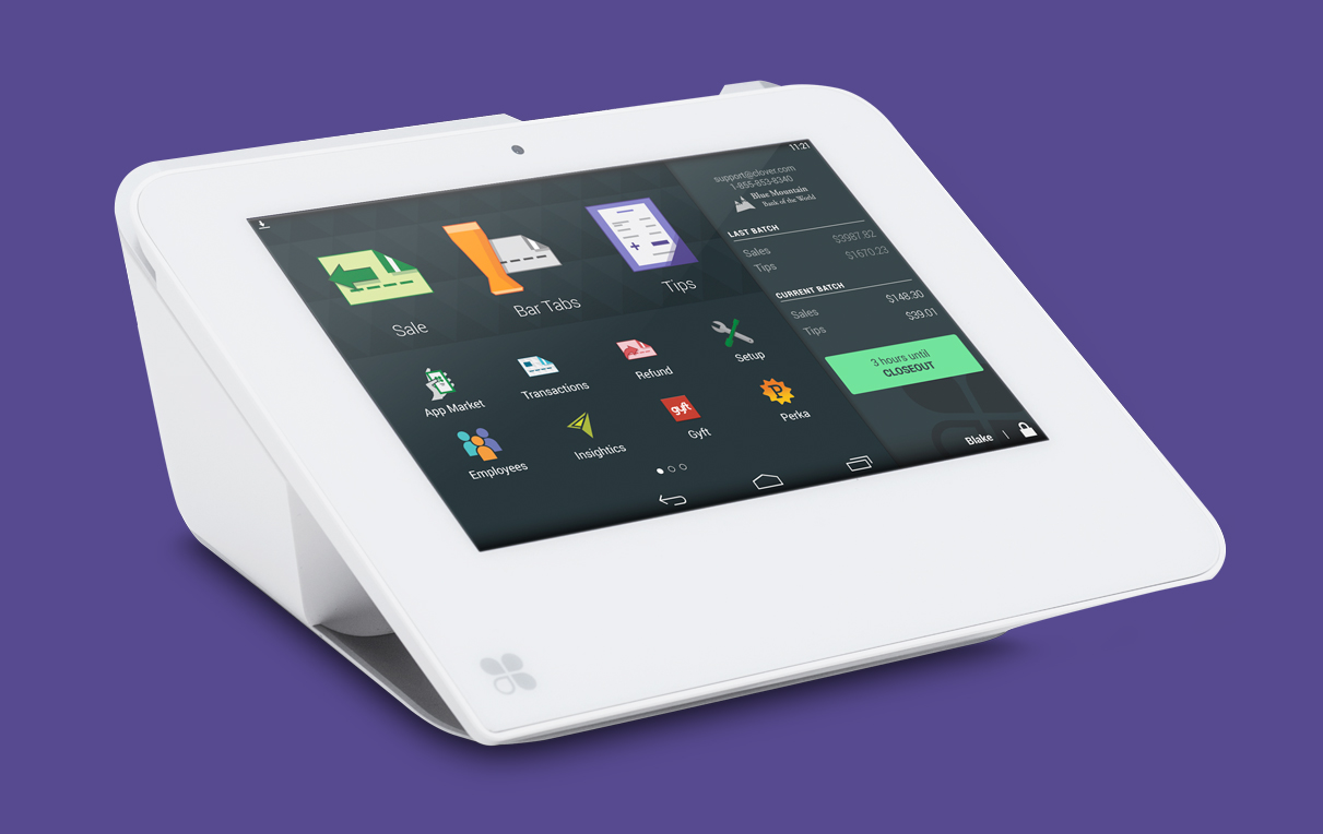


See how the new branding applied to the Clover Tips App, Clover Core Apps, and Clover Product Setup Guides.